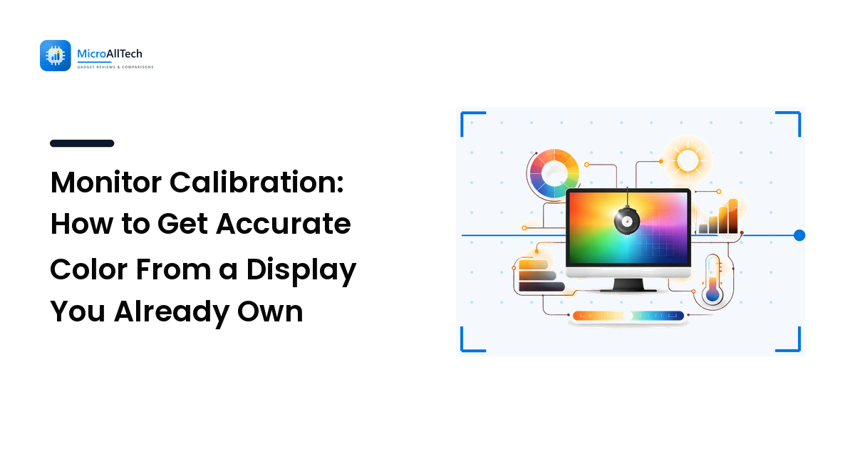
Here is the uncomfortable truth about calibration: the monitor on your desk almost certainly does not show accurate color out of the box, and the way most people "fix" it — dragging the RGB and brightness sliders until the picture looks nice — usually makes it less accurate, not more. Your eyes adapt. They will happily call a blue-tinted, crushed-shadow image "good" after thirty seconds of looking at it. Calibration is the discipline of replacing that gut feeling with a target you can hit on purpose.
The key takeaway up front: calibrating means steering the display toward a defined standard — a white point, a gamma curve, and a color space — not toward whatever you personally find pleasant. Get the target right and the screen becomes predictable. Skip the target and you are just rearranging the error.
The hard problem: your eyes are the worst measuring tool you own
The reason calibration is genuinely difficult is that the instrument most people use is the human visual system, and it is built to hide the very errors you are trying to find. Two mechanisms work against you.
First, chromatic adaptation: look at a warm, yellowish white for a minute and your brain rebalances until it reads as neutral. Switch to a cool screen and the same thing happens in reverse. This is why a monitor can look "fine" while being 1000K off — you adapted to the error and stopped seeing it.
Second, simultaneous contrast: a gray patch looks darker against white and lighter against black. So when you judge shadow detail or gamma by eye, the surrounding image is actively lying to you about the value of every pixel.
This is the whole case for measuring instead of eyeballing. A colorimeter does not adapt and does not care what is next to the patch. But even without one, you can do far better than freehand sliders by calibrating to known reference images rather than to vibes.
Define the target before you touch a slider
Calibration without a target is just fiddling. Decide these three things first, because they are what you are steering toward.
White point — 6500K (D65) for almost everyone
White point is the color of "white." The standard reference is D65, roughly 6500 kelvin — the white used by sRGB, by web content, by virtually all video, and by photo standards. A screen set warmer (say 5500K) looks yellow and is only correct for specific print-matching workflows under controlled lighting. Cooler (7500K+) looks crisp and blue and sells well in stores, which is exactly why so many panels ship that way. Unless you have a deliberate reason, target 6500K.
Gamma — 2.2 is the default that matters most
Gamma describes how the screen maps input signal to brightness across the tonal range. The standard is gamma 2.2. Get it wrong and midtones go muddy or washed out even when your color is perfect. Gamma is the single most common thing people get backwards by eye, because a too-bright or too-dark midtone "reads" as a brightness problem and they reach for the brightness control instead.
Color space — sRGB unless you know you need more
For web, office work, and most everyday content, your target gamut is sRGB. Wide-gamut panels (DCI-P3, Adobe RGB) can show more saturated colors, but feeding them ordinary sRGB content without color management makes everything look cartoonishly oversaturated — reds glow, skin tones turn orange. If you do not work in a color-managed pipeline, lock the monitor to its sRGB mode and you have removed an entire class of error for free.
The method that actually works
This is a repeatable sequence. Steps 1–4 need no hardware; steps 5–6 are where a colorimeter earns its keep.
- Warm up and fix the room. Turn the monitor on for at least 20–30 minutes — panels shift color as they reach thermal equilibrium. Set moderate, consistent room lighting and get bright windows out of your direct field of view. Calibrating in a dark cave or full sun gives you numbers that fall apart the moment conditions change.
- Reset to a known starting point. Factory-reset the OSD or select the sRGB / Standard preset. Many monitors lock out useful controls in their fancy "vivid" or "HDR" modes, so start from the plain one.
- Set brightness to your room, not to maximum. A common comfortable target is around 120 cd/m² in a typical room — and for the vast majority of people, that means turning brightness down. Eye strain is far more often a too-bright screen than a calibration fault.
- Set gamma and white point in the OSD. Choose the gamma 2.2 and 6500K presets if available, and confirm gamma against a test pattern (a gamma chart where the patterned region blends into a solid gray at the correct setting). This is your eyeball doing its one reliable job: matching a pattern to a solid, which contrast tricks affect far less than judging absolute color.
- Measure with a colorimeter. A hardware colorimeter plus its software reads patches off the screen and tells you the truth: your actual white point in kelvin, your gamma curve, and per-color error. This is the step that converts opinion into data.
- Build an ICC profile. The software generates a correction profile your operating system loads at startup, nudging output toward the target. Re-profile every few months — panels drift as they age.
A worked example: the "calibrated" laptop that was 900K off
A creator complains their edited photos look too warm on everyone else's screens. Their laptop "looks perfect." We measure it: white point reads 5600K, gamma 2.4, brightness 310 cd/m².
Decode that. The screen is running warm (5600K vs the 6500K target), so the operator's eyes adapted to yellow and they were adding blue to their edits to compensate — which is why their photos looked cold everywhere else. Gamma 2.4 was crushing shadow detail, so they were lifting shadows that did not need lifting. And 310 cd/m² is roughly two-and-a-half times a sensible room level, fatiguing their eyes and pushing them to over-edit.
The fix was not a single slider. We dropped brightness to ~120 cd/m², set the white point toward 6500K, corrected gamma to 2.2, and built an ICC profile. The screen looked worse to them for about a day — too blue, too dark — because their adaptation had to unwind. By day three it read as neutral, and their exports started matching other displays. That temporary "it looks wrong now" reaction is the signature of a correct calibration undoing an error your eyes had normalized.
Common mistakes and why people make them
- Calibrating by eye and trusting it. The root cause is adaptation and contrast — the two effects above. Your brain is optimized to make any screen look acceptable, which is the opposite of accuracy.
- Cranking brightness "for clarity." Bright looks punchy in a showroom, but a 300+ cd/m² screen in a normal room is a fatigue machine and skews every brightness judgment you make afterward.
- Confusing calibration with profiling. Calibration changes the display's behavior (brightness, gamma, white point). Profiling measures what remains and writes a correction the OS applies. You need both; tuning the OSD alone leaves residual error, and an ICC profile alone cannot fix a wildly off starting point.
- Forgetting the panel lottery. Two units of the same model can differ in color and uniformity because of manufacturing variance. A factory calibration report applies to the panel it was made with — yours may be close or not. This is exactly why measuring your unit beats trusting a marketing spec, and it ties straight back to how panel technologies behave (see /display-technology-explained).
- Wide-gamut without color management. Letting a P3 panel display sRGB content uncorrected makes everything oversaturated, then people "calibrate" toward that look and bake the error in.
Edge cases and caveats
- OLED and local-dimming panels can shift behavior with overall brightness because of how they manage power and dimming zones, so calibrate at the brightness you actually use.
- HDR is a different target entirely. It uses the PQ curve, not gamma 2.2, and a far higher peak brightness. Calibrate SDR and HDR separately; do not assume one fixes the other.
- Built-in "factory calibrated" modes are a real head start on good panels, but they are calibrated to the maker's chosen target under their conditions — verify it matches yours before trusting it.
- Cheap or aging panels may simply lack the controls or stability to hit the target. At some point the honest answer is that the hardware is the limit, not your method.
The one trick to remember
When you finish, the screen should look slightly less exciting than the vivid preset you started from — a touch warmer, a little dimmer, more restrained. That mild disappointment is the tell that you calibrated to a standard instead of to your own adapted eyes. Accuracy is supposed to look ordinary. If your calibration made the picture "pop," you almost certainly calibrated to the error.
FAQ
Do I need a colorimeter to calibrate my monitor?
For accurate results, effectively yes — it is the only way to measure white point, gamma, and color error objectively. Without one you can still improve things meaningfully: reset to the sRGB preset, lower brightness to room level, and match a gamma test pattern. That removes the biggest errors, but it cannot certify accuracy.
What white point and gamma should I target?
For nearly all content, target 6500K (D65) white point and gamma 2.2. These match sRGB, web content, and video standards. Only deviate for a specific reason, like print matching under controlled lighting.
Why does my screen look worse right after calibrating?
Because your eyes adapted to the previous error. A screen that was running blue or too bright will look warm and dim once corrected, until your adaptation unwinds over a day or two. Give it time before judging — the "worse" reaction usually means the calibration is working.
How often should I recalibrate?
Every couple of months for color-critical work, since panels drift as they age. For casual use, recalibrate if you change rooms, lighting, or notice colors looking off. Always re-profile after a panel repair or firmware update.
Is my laptop or monitor's "factory calibrated" claim enough?
It is a good starting point on quality displays, but factory calibration applies to that unit under the maker's conditions and target — which may not match your room or your needs. Because of panel-to-panel variance, verifying your specific screen still beats trusting the spec sheet.
Next step
Pick your target before anything else — sRGB, 6500K, gamma 2.2 for almost everyone — then steer the display toward it rather than toward what looks good. Warm up the panel, reset to a known preset, bring brightness down to room level, and if accuracy matters, measure with a colorimeter and build an ICC profile. A screen calibrated to a standard you can verify will beat a prettier one you tuned by feel, every time. And if your panel simply cannot hit the target, that is the hardware talking, not your method — compare 4K monitors on MicroAllTech when it is time to upgrade.